

When it comes to drawings and illustrations, colors are not just decorative: they are the heart of the atmosphere, the message and the visual impact. Among the fundamental concepts that every creative should know is that of complementary colors. But what are complementary colors and, above all, how can you use them in your drawings to make them stand out? In this article, I will explain everything you need to know, with practical examples and some tricks of the trade.
What are complementary colors?
Complementary colors are pairs of colors that, when placed next to each other, create a strong contrast, while, when mixed, they tend to neutralize each other. But don’t worry, this isn’t lab science: it’s visual magic that you can harness in your designs. To find the complement of a color, just look directly at the other end of the color wheel. For example, red and green, blue and orange, yellow and purple are pairs of complementary colors.
This is the Itten Circle, a representation developed by Jonas Itten, which represents well what is meant by primary and secondary colors (and therefore complementary:
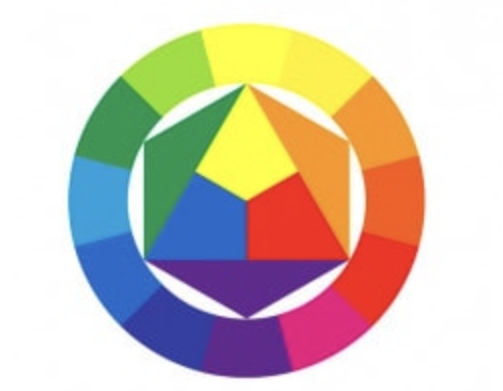
Looking at the Itten circle you can see the 3 primary colors in the center, from whose mixtures the 3 secondary colors derive. On the opposite side of each primary is shown the corresponding complementary color.
What are the 4 main complementary colors?
If we want to simplify as much as possible, we can identify three basic pairs of complementary colors between them:
- Red and green
- Blue and orange
- Yellow and purple
Of course, these can vary depending on the shades, but they are a great place to start. Once you get the hang of it, you can experiment with endless combinations! For every color on the color wheel, the opposite position is occupied by its complementary.
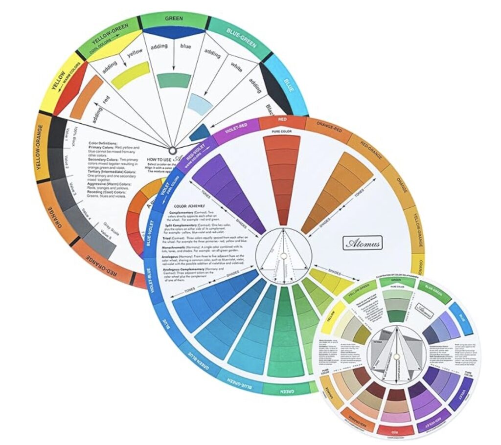
How do you get a complementary color?
To determine a complementary color, you can use digital tools such as Adobe Color or Canva Color Wheel. If you prefer a more practical approach, a physical color wheel is a perfect ally. I always keep one on my desk: it’s a simple but essential accessory, and you can easily find it on Amazon.
Why use complementary colors in drawings?
Complementary colorscreate a very strong contrast that draws attention and adds depth to your compositions. Want to make a character or object the focal point of your drawing? Use the complementary color of the background to make it stand out. For example, a character in an orange dress will stand out incredibly against a blue background.

Tips for using complementary colors in drawings
- Balance is the key. Avoid using complementary colors in equal proportions. The ideal is to choose a predominant color and use the complementary as an accent.
- Shades and tones. Don’t limit yourself to pure colors. Play with shades and tones to achieve more refined effects.
- Lighting and atmosphere. Remember that the choice of complementary colors also changes based on the lighting. In a bright environment, the contrast will be more marked; in a darker context, the colors will blend better.
Tools and resources for complementary colors
If you work digitally, tools like Procreate or Adobe Illustrator offer built-in functionality for choosing complementary colors. You can also try pre-made palettes on sites like Coolors.co.
For those who like the traditional, however, sets of watercolor pencils and markers, like those from Faber-Castell, are a great investment. Here is a high-quality set that I often use for my sketches.
Practical examples: when to use complementary colors
- Landscape illustrations: Want to create a stunning sunset? Combine yellow and purple to simulate the golden hour.
- Brand design: Complementary colors work great for logos and advertising graphics. A blue logo with orange accents will elegantly capture attention.
- Abstract Art: Complementary color pairs are perfect for creating vibrant contrasts in abstract compositions.
Conclusion: Transform Your Designs with Complementary Colors
Using complementary colors in your designs is one of the easiest and most powerful ways to enhance your creations. They are perfect for adding energy, contrast, and harmony to your work. Next time you pick up a pencil or start a digital project, experiment with complementary colors and see how they can transform your work. And if you have any questions or want to show me your creations, write to me: I love seeing your masterpieces!
Read also
Cover image generated with artificial intelligence software.
